Component Library
Design System for Construction Management Software
Overview
Built comprehensive design system for Component Assembly Systems' construction management platform, spanning web and iOS applications.
Created unified visual language, reusable components, and documentation that accelerated development cycles.
Role:Lead Product Designer
Timeline:2024-Present
Platform:Web & iOS
Design Tokens
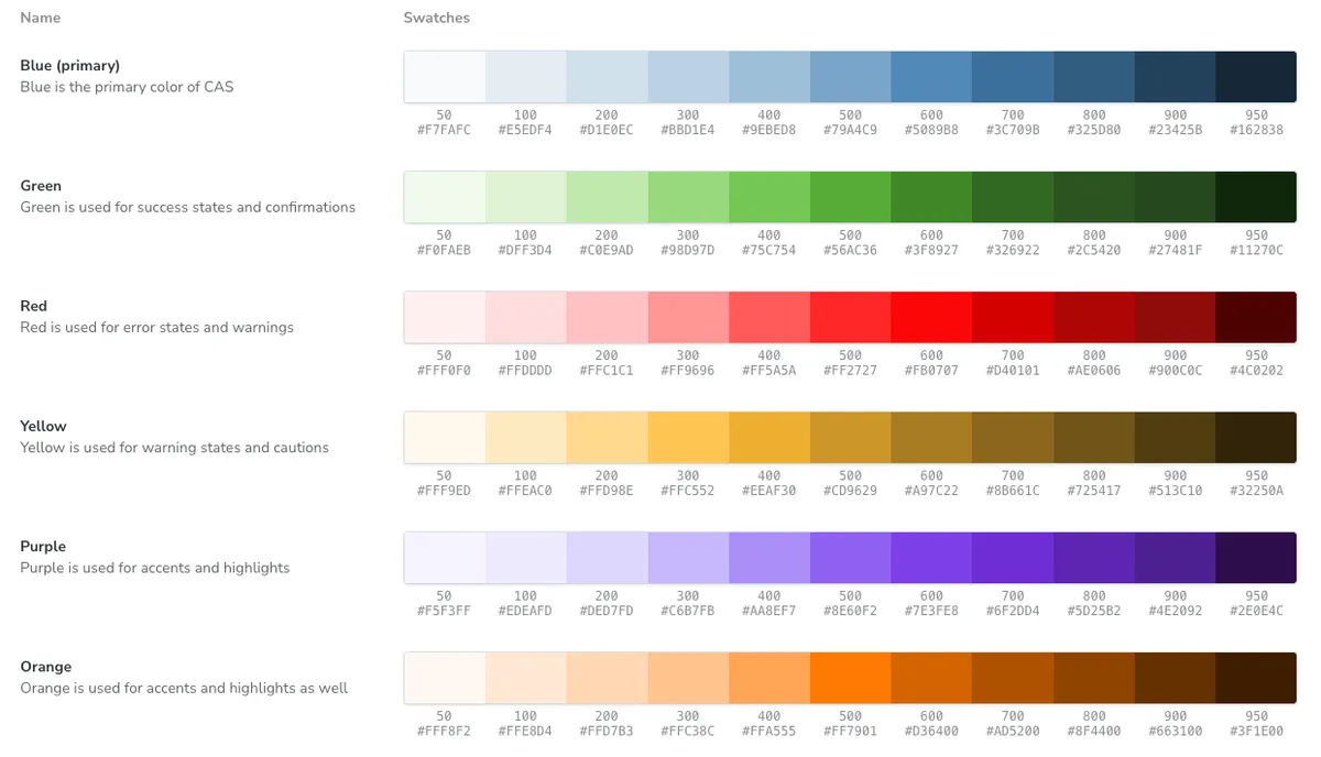
Color Palette
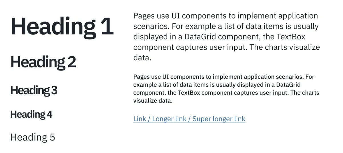
Typography
Spacing & Sizing
  --cas-spacer-xxs: 0.25rem; /* 4px */
  --cas-spacer-xs: 0.5rem;   /* 8px */
  --cas-spacer-sm: 0.75rem;  /* 12px */
  --cas-spacer: 1rem;        /* 16px */
  --cas-spacer-md: 1rem;     /* 16px */
  --cas-spacer-lg: 1.25rem;  /* 20px */
  --cas-spacer-xl: 1.5rem;   /* 24px */
  --cas-spacer-xxl: 2rem;    /* 32px */
  --cas-spacer-xxxl: 3rem;   /* 48px */
Iconography
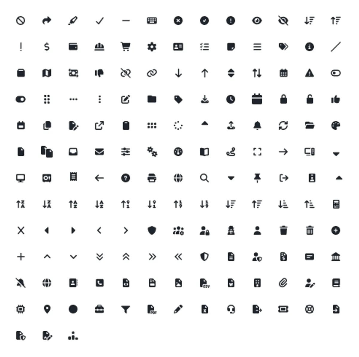
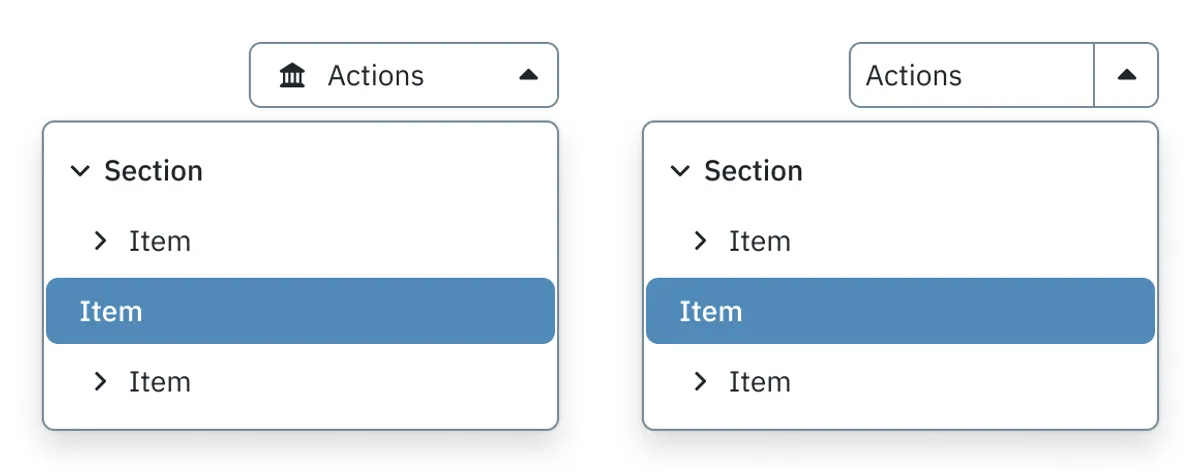
Components
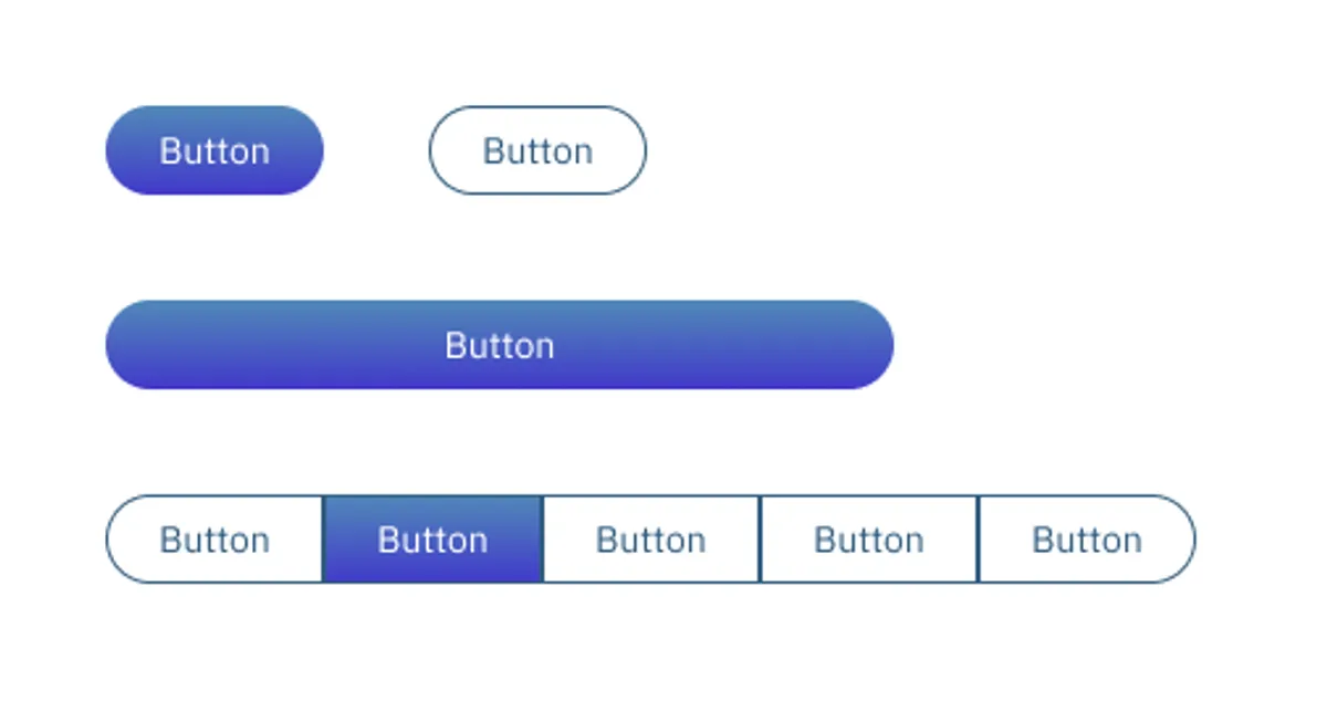
Buttons
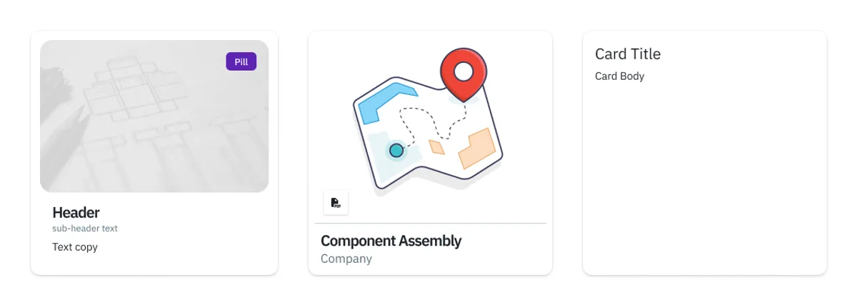
Cards
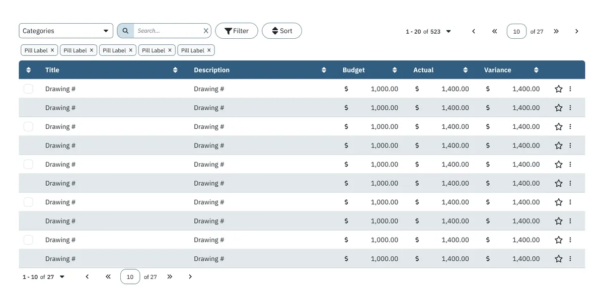
Data Tables
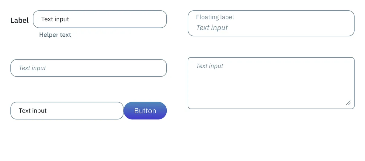
Forms, Inputs, Dropdowns
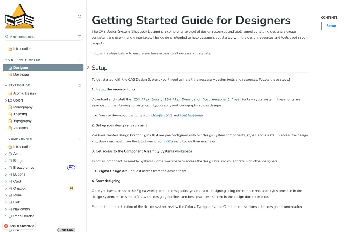
Documentation
All design and component documentation was created using Storybook.
Impact
- Established first unified design system across web and iOS
- Reduced design-to-development handoff time by providing production-ready component specifications
- Created foundation for rapid feature development and consistent user experience
- Documented design tokens and usage guidelines for engineering team